![]()
The Free Market Center
![]()
The Free Market Center
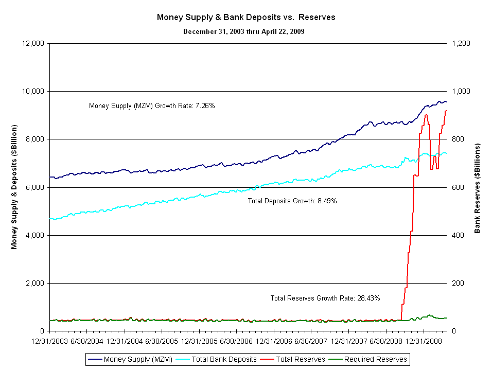
This chart compares the Money Supply (MZM) and Total Bank Deposits to Total Reserves and Required Reserves.
Note: This chart covers the period from January 2004 to April 2009, the only period for which I have all this data.
During most of this period money supply and bank deposits both grew, while total reserves and required reserves remained flat. This pattern represents symptoms of the shift in reserve requirements. The fact that the growth in money supply does not match the surge in total reserves (and excess reserves) demonstrates that the Fed has only an indirect influence on monetary growth. These excess reserves will not lead to monetary growth until borrowers borrow and banks lend at a pace that absorbs these excess reserves. (Hope that does not happen.)
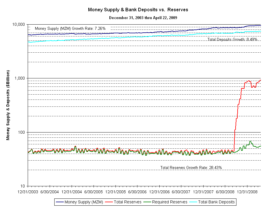
Again, this chart presents the same information on a semi-log scale chart.
© 2010—2020 The Free Market Center & James B. Berger. All rights reserved.
To contact Jim Berger, e-mail: