The Free Market Center
The Free Market Center
| Shoe Production Fixed | 0.00%/Month |
| Wheat Production Fixed | 0.00%/Month |
| Money Supply Fixed | 0.00%/Month |
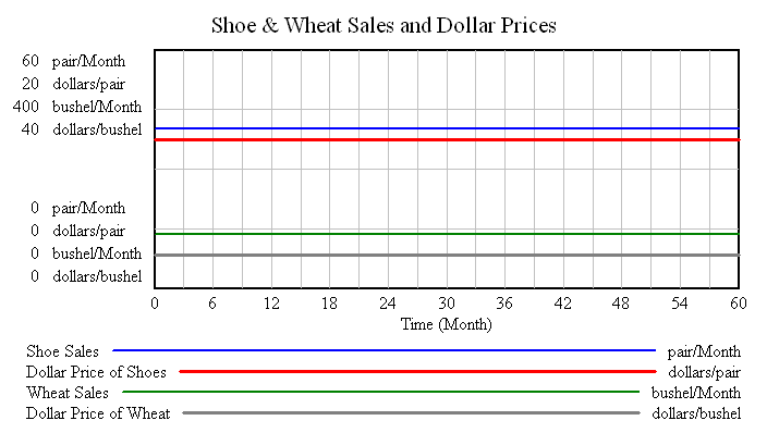
Seeing the effects on this small economy when all production (rates) and the money supply remain fixed gives us a base from which to understand what happens when these factors change.
Because the following charts have more information than the previous ones, I thought you might find a reiteration of the general description helpful.
The legend below indicates which line represents which variable. (Match the color on the chart with the color in the legend.) It also indicates the unit used for that variable.
On the chart the bottom (X) axis indicates time in months, from 0 through 60. On the vertical (Y) axis, each variable has its own scale. The order of the scales for the variables coincides with the order in which they appear in the legend.
You should find this quite straightforward on this chart, but it may get a little confusing with charts in which variables change over time.


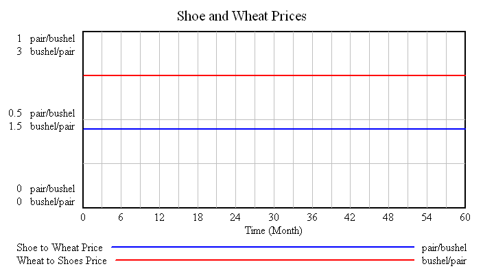
The exchange ratios in direct exchange also remain constant throughout this time period.
Keep one relationship in mind when looking at this and the following charts. You can calculate the direct exchange ratio from the dollar prices of the two products.
For example:
$12.50/pair divided by $5.56/bushel = 2.25 bushel/pair
$5.56/bushel divided by $12.50/pair = 0.44 pair/bushel
Note: I have included charts showing the direct exchange relationship under the same conditions on each of these pages. You might find the comparison helpful.
© 2010—2020 The Free Market Center & James B. Berger. All rights reserved.
To contact Jim Berger, e-mail: